Divers
L'Afrique c'est grand
Le post
Voir sur
Discovering the true size of Africa is insightful...
A titan rich in diversity, resources and potential...
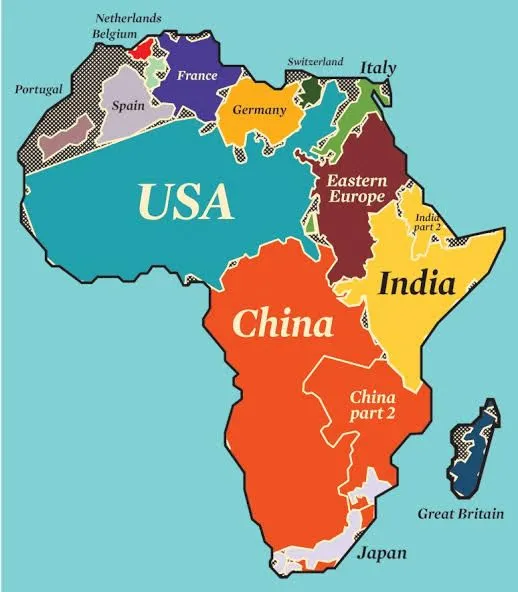
• The USA can fit inside Africa 3x.
• China, India and most of Europe could all squeeze into Africa comfortably.
It's time for a worldview shake-up! 🌍
Now let's plunge into more interesting facts:
📌 Population: > 1.3 billion people (50 % < 21yrs, 40% adults are illiterate).
📌 Resources: Gold, diamonds, oil, platinum (30% world's remaining resources).
📌 Religion: Christianity and Islam are dominant.
📌 Number of countries: 54 (90% was colonized by Europe & UK).
📌 25 Poorest countries in the world:
Burundi, South Sudan, Malawi, Mozambique top the list unfortunately.
The continent has so much to offer 💚
Repost ♻️ to share these facts.
PS: Share your thoughts or insights...
Follow Linda Reddy 🌎
#africa
#diversity
#resources
#lindareddynetwork 🌍🌍🌍

Le débunk
With so many topics to explore and limited space (just 1,250 characters), we’ve chosen to focus on the true size of Africa and how it's often misrepresented on maps.
First, Africa is massive—much larger than most people realise. You can indeed fit Europe, China, and the United States into it with room to spare! Kai Krause's "Geographic Tetris" exercise vividly illustrates this astonishing fact:
https://cvc.li/hRYRn
The actual surface area of Africa is accurately reported, but the way it appears on traditional maps is distorted. This is because of the Mercator projection, a map design dating back to 1538. It was created to aid European navigation but inflates the Northern Hemisphere while compressing the South, shrinking Africa in the process.
Another map, the Peters projection, was adopted by the UN in 1961 to correct this imbalance. Although it provides a more accurate scale, it’s still not perfect in terms of visual representation.
To truly appreciate Africa’s size and importance, this graphic serves as a powerful visual reminder:
https://cvc.li/tahSx
Vous avez une question, une remarque ou une suggestion ? Contactez-nous en en indiquant le titre du débunk. Nous vous répondrons au plus vite !
Contactez-nous
